Professional graphic design is a true art form, filled with immense skill and the wisdom of experience (shout out to all our talented design friends!). But we believe everyone has a bit of designer in them! If you’ve held any role in marketing or adoptions in animal welfare, or work for a small team, you’ve likely had to whip up a promotional design at one point or another regardless of your credentials. We understand how daunting it can feel to stare at a blank canvas with no idea where to start, especially if you’re self-taught or just learning the ropes, and we’re here to tell you you’re not alone! Whether it’s a simple social media post, a large billboard, or somewhere in-between, there are a few key principles that can be applied to just about any type of graphic design to make it feel more polished, readable, and visually appealing. Here are a few of our favorite tips, especially for those just starting out:
 1.) Keep it simple
When designing marketing materials, one of the most important things to keep in mind is simplicity. It’s easy to get carried away with the abundance of design options out there: shapes, lines, drop-shadows, fonts, colors, and so much more. But, adding too many elements may end up distracting your viewer. To keep your design more simple and uncluttered, focus on one or two main elements and make them stand out!
2.) Use contrast
Do you ever look at a design and find that your eyes are immediately drawn to a certain aspect of it? That, my friend, was probably thanks to the use of contrast. Contrasting colors, fonts and shapes can help to make certain elements of your design stand out, making it more visually appealing and easier to read. In fact, the use of contrast is especially important in ensuring your design is accessible to those with visual impairments (i.e. color-blindness or low vision). For example, if your heart is set on a pastel color palette, use the lighter tones in the background and add darker tones for the text. Or, if your design has a darker theme, try out some lighter toned text with a dark background. This will not only help to create a strong contrast that draws the viewer’s eye, but also make it more dramatic and memorable.
 3.) Stick to a color palette
When you think of any given brand, company, or organization, your brain likely associates them a with a particular set of colors. A limited color palette has been known to help viewers recognize specific brands and can help to create a more cohesive look throughout your marketing materials, especially when creating multiple designs that belong to a collective campaign. So, instead of choosing your colors on the fly, pick out two or three main colors and use them consistently throughout your branding and marketing materials. After some time, your audience will start to recognize these design elements and associate them with your brand or organization.
4.) Choose readable fonts
No one enjoys having to squink their eyes to make-out the words on a design. After all, the whole point of graphic design is to get information across to your viewer in a visually appealing yet digestible way, so readability should be one of your top priorities. This isn’t to say that you shouldn’t use fun fonts at all, just make sure they’re simple enough for the average viewer to digest easily. Another quick tip: avoid using more than two different fonts in a single design, as this can also contribute to making the design look cluttered and difficult to read.

5.) Use whitespace
Ahh, whitespace. Many peoples’ first instinct when creating a design is to use every inch of space available on the canvas, but we’re here to tell you that sometimes, less is more! If you aren’t already familiar, whitespace is the empty space around the different elements in your design. It helps to create a sense of balance and visual hierarchy, while guiding the viewer’s eyes to the focal point of the design. Without whitespace, your audience may have a harder time deciphering the important aspects of your design, which can lead to confusion.
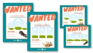
 6.) Add visuals
High-quality images or graphics can make a design more engaging to your audience. They can also help to make an emotional connection or tell a story, which is prevalent in the world of animal welfare marketing. When choosing visuals, make sure they are relevant to the message you want to convey. For example, if you’re promoting an event or special, use happy, feel-good imagery that goes with the theme of your event. If you’re promoting a difficult situation or something more somber, use emotive imagery that is consistent with your tone but offers hope. Lastly, try to choose images that match the theme of your graphics, color-wise.
7.) Align elements
Aligning elements in the design creates a sense of order and can make the design look more intentional. Similarly to whitespace and contrast, it helps guide the viewer’s eye in a specific direction, leading them to the focal point of the design. Whichever alignment you choose, make sure that the main elements of the design are flowing in the same direction, so they look visually balanced.
 8.) Use templates
Design templates are pre-designed layouts that can be customized with your own content, like the variety we have available in our Marketing Resource Center, as well as websites like Canva. Anything from Instagram story templates, to printed flyers, to email newsletters and so much more, these resources do the heavy-lifting of starting a design from scratch, for you. And the best part it: most of these resources allow you to plug and play with different colors, fonts, photos and more, in order to make the design unique to your brand or organization.
9.) Get feedback
Two (or three or four!) heads are better than one! After completing your long-awaited digital design, be sure to show it to others and ask for feedback. A fresh pair of eyes will not only help you refine the design itself, but will also provide you with an outsider’s opinion on how it made them feel. Did it entice them to make an action? Was it memorable and informative? This will give a glimpse into your target audience’s mind and make it more effective in reaching them.
Are you feeling like a pro designer yet? It takes a while to refine any technical skill, but you have to start somewhere! The top-secret 10th tip is to experiment and exercise your creativity. Keep these tips in mind the next time you’re working on a digital design and remember: practice makes perfect!