When I first started running the volunteer photography team at the Humane Society of Broward County, I felt a sense of duty to capture the most beautiful images possible. Images that would truly help animals get adopted. Now, after two years of taking and editing animal intake photos every work day, I have stumbled upon some unexpected epiphanies that have helped step up my shelter’s photography game!
1. Your go-to lens might not always be the best option.
In all of my previous studio work, my “nifty fifty” (or 50mm) lens was my master tool! I have worked with it long enough that my photos come out exactly how I want. However, this lens isn’t always ideal for our shelter’s everyday pet intake photos. That’s because:
- The focal length is awkward to use due to my shelter’s setup because I only have so much room to move back from my subject.
- The combination of this being a prime lens (meaning you cannot zoom) and the small intake space dramatically reduces the type of photos I can take. I’m often limited to face and bust shots only.

We typically have to take photos of cats within their cages, and the room in which I take dog photos is quite small. This lens requires that I be at least 5-10 feet away from the subject in order to take a clear, full-face photo. If your situation is anything like mine, this may be a challenge you’ll face, too.
My suggestion would be to stick to your basic 18-55mm lens, preferably the one that came with the body of the camera. This lens will give you the flexibility required for the shelter environment while still being inexpensive enough to replace if the unexpected happens.
All that said, if I’m able to take the dog outside or get the cat in a larger room, the nifty fifty goes right back on! Check out some more shelter photography set-up inspiration here.
2. More is not always better. (In fact, it’s usually worse.)

It can be extremely frustrating to take dozens of photos and not have a single usable shot – the dog won’t stop moving, the cat looks irritated, or the pet won’t make eye-contact, for example.
A photoshoot is not a battle of wills, and the more time you spend pushing the situation if it’s not working naturally, the less likely you are to get the photo you need. Plus, you’ll have more to sort through at the end of the session than you really want!
While it is always disappointing to leave a session empty-handed, know when to step away and try again another day. Maybe the pet needs some more time to settle in, or perhaps there’s a different environment they’d be more comfortable in. Be responsive to their body language and needs, and remember that a shelter is already a stressful environment for them before adding lights and clicking shutters.
And sometimes a quick breather can be just the key to recapturing your own creative juju and motivation!
3. Backgrounds make a noticeable difference
 This point is a matter of taste and the ‘branding’ of your organization, but through my experience, the simpler the background, the easier it is to showcase the beauty of your furry model!
When I first started at the HSBC, I instantly purchased a blue wood-grained background because it fit with our branding and looked fabulous on the website. While the background itself never posed a problem, it wasn’t until I switched to a simpler, solid light blue background that I noticed the sheer power of simplicity. Specifically:
- It was easier to Photoshop leashes, hands, etc. out since I did not have to worry about matching the pattern of the woodgrain.
- The monochromatic background made lighting and white-balance less of a challenge.
- The animals “pop” more when they’re not competing with a pattern behind them.
If you work outdoors or inside without a backdrop, try to find a simple or monochromatic area in which to take your photos, or pull your subject well away from the background and use a small aperture to blur out the clutter behind them.
Learn more about how to blur backgrounds and get great photos in any setting in Part 3 of HeARTs Speak’s Shelter Photography Basics info series.
4. Consistency isn’t always key.

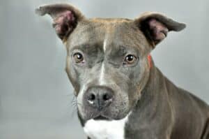
When I first started at the shelter, I worked to maintain a very consistent composition in all of my photos. Dog seated, body slightly angled, or cat resting at an angle, alert face pointed at me and cropped just below the chest. It was a very professional, clean, and attractive look that worked for every pet. It was also incredibly boring.
At any time, we have about 50-70 dogs and 80-100 cats at the shelter, and they are all listed at about 150×200 thumbnail on the website, it gets pretty hard to tell each pet apart when every image is composed the same.
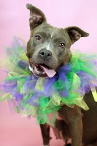
So, at first, I began mixing up the backgrounds. I was lucky enough to be able to find an affordable double-sided backdrop that instantly added two more colors to the mix. This allowed some dogs’ pictures to stand out a bit more and break up the monotony.
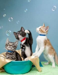
After a while, I allowed toys and other props into the photo if it helped to bring the pet’s personality out. Was it a dog that went bonkers over a tennis ball? Great! I let him have the ball. Cat striking cute poses while chasing after a fishing toy? Fantastic! Action shots it is!
And, on that note…

5. Sometimes the bloopers are the best!
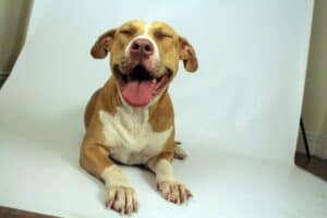
While exploring some of those less traditional photo styles, a silly face or two would always make it into the mix, but if I felt that it communicated an endearing part of the pet’s personality or provided a lot of emotion for an adopter to get lost in, that would be the photo we’d use.
I truly believe that it is our job as shelter photographers to serve the needs of our pets: to capture their beautiful traits and personalities in hopes of finding perfect homes. If that means bending a few photography rules along the way, well….rules were made to be broken!

